
Peter Godwin: Space, Light and Time
Lucy Stranger’s newest curation treats Peter Godwin’s Space, Light and Time exhibition as a window into an oeuvre of painterly skill depicting a personal visual language verging on the romantic.


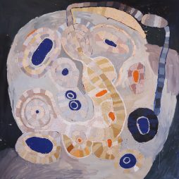
Dark and alive with momentum and verve, there is something extraordinarily immediate in Godwin’s play across the picture plane. Channelling the eighteenth century master of the still life, Jean Siméon Chardin, with tightly stepped horizontals that give incremental and fine depth, the foreground is abundantly realised as a world of amassed objects, furniture, clutter, art, and space. And then come the verticals, with large window-like voids of dark, scratch-framed tempera. These veil-like tempera washes add ambiguity and form to the reading of the painting, allowing the artist to be simultaneously present and absent, while bestowing an ethereal or romantic quality to the work.
The windows, doors, and walls that read as voids repeat throughout the exhibition, with many of the paintings centred by a large rectangular abyss where, strangely, the immediacy of the work is most apparent. Granted, the quick brush strokes of a dove or owl have this immediacy in spades, but the large flat areas are imbued with the same buoyancy. Egg tempera is both an immediate and changeable medium, with erasure possible if deemed not quite right (the ghosts of past decisions remain as spectral memory of time). As such, the work is a single execution, though the final pieces comprising the final composition may be the last in a long line of attempts.
To an extent the objects and figures signalling meaning—an owl, a tribal artwork, a statue, a chair, a skull, and others that reappear throughout the work—contain a whole world of art history. The references are overt, such as the blue and white curtains pointing to Cézanne in The blue curtain / studio, 2007. Or they are evocative, with the harlequin wall treatment in Large Green Interior (Souvenir de Ghent), 2005, merging Picasso’s Harlequin, 1915, and the green of Matisse’s palette to remind us of something and everything all at once. As a composition, this painting shares the same three-part division of Matisse’s Robe Jaune Et Robe Arlequin, 1940, with the harlequin shifted from dress to wall and the pattern borrowing the green from the central panel. It is a neat trick that triggers a memory without holding ground.
Bradley Hammond, director of Orange Regional Gallery, describes Godwin’s work as “personal,” adding, “There’s an intimacy in his paintings, a sense that he’s working out a kind of language for himself, but also working with tradition at the same time.” In particular, Hammond points out that the space’s interior life is profoundly self-contained. “There’s an inward quality of being in a space that sets it aside from the world through a few objects placed and arranged repeatedly to give a Morandi-like quality,” says Hammond.
The tropes of modernism—tribal art, masks, and animal figures—abound as referents to a genre without being overly specific. Likewise, the subjects of still life painting are intact as the starting point, with the known and understood forming a basis from which to extrapolate. The squid, fish, and lemon series of 2008 (Squid, Smoke, Fish, Lemon, and Squid, Fish, Lemon, are both in the exhibition) for example, follows the Chardin school of creating a shallow planar space to set up depth of the picture plane, which in turn questions the illusionary space beyond. In these works, the squid create the rise in each step up, step back, reiteration of mark, inhabiting the foreground. The squid themselves, while recognisably squid, are effectively abstract marks creating the spatial composition. Squint and it could easily be a depiction of rolling hills receding into the night.
Interestingly, while the style of abstraction associated with Braque and Picasso is apparent, the tilting of the picture plane that really set them apart from traditional perspective painters is mostly rejected. That said, the most recent of Godwin’s works in the exhibition, Studio Nocturn, 2024, and Kuro ao to shiro (Japanese Black, Blue and White), 2024, are significantly flattened in comparison, as exhibition curator Lucy Stranger notes, “Space is constructed, flattened and distorted across Godwin’s practice as he explores its endless dimensions.” And herein lies the rub. Godwin is an artist at ease with his references, drawing from Braque, Bonnet, Cézanne, Picasso, Matisse, Motherwell, and Fragonard. It seems an unlikely mix but toss in Ian Fairweather and the cogs start falling into place.
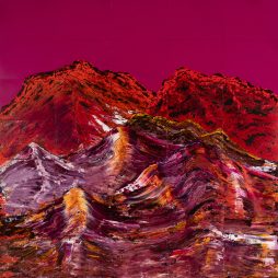
In the hallway leading to the large exhibition space in the recently expanded gallery sits the most exciting work. Comprising a series of very large hand-painted carborundum relief works, the central piece is Red Mountains, White Cloud, 2015, with Red and Green Mountain, Li River, 2015, on the facing wall. In his essay, John McDonald notes that these giant works (the largest is a triptych measuring 246 x 366 cm) were painted on the ground with Godwin using a broom to apply the gestural strokes representing calligraphy.
In placing these images at the start of the exhibition, they act as a means to view the rest of the show, which is not diminished at all. Rather, one informs the other, with the overall exhibition experience being directed but not impeded. It is an exhibition worth some time and observation, with a title that suits the work well.
This review was originally published in Artist Profile, issue 69
EXHIBITION
Peter Godwin: Space, Light and Time
4 January – 22 February 2025
S. H. Ervin Gallery, Sydney
Designed to impress, the number and size of paintings—twenty-nine at nine square metres each and one even bigger—are a spectacle, lifting the exhibition from an...
Skilfully assimilating secondary sources throughout Paris in Ruins, Smee at the conclusion of Part One, “Salon of 1869,” writes that Auguste Renoir’s and Claude Monet’s...
Multidisciplinary artist Shireen Taweel looks skyward, into the night and beyond, with her exhibition the trig point. Drawing on fieldwork in 2025 at the Siding...
It was back in 2011 that Pip Wallis, senior curator at the Monash University Museum of Art (MUMA), remembers first seeing the work of Balinese...
Senior Pitjantjatjara artist, Tuppy Ngintja Goodwin, was born in 1952 near Bumbali Creek in the Northern Territory, close to the border with South Australia; daughter...
For those of us who seek out unfamiliar voices and see the potential for diverse cultures to create new meanings and memories in a postcolonial...

Show me the beauty of a body contorted by thrall. Then, show me the thrall. Shame is a vast word....
Kon Gouriotis: How did you come to be working with the Yinhawangka community? Pedram Khosronejad: My journey to working with the Yinhawangka community has...
The Art Gallery of South Australia’s (AGSA) Adelaide Biennial of Australian Art has seen real competition over the past two decades, as other institutions have...