Kristin Headlam
After five years in the making, Kristin Headlam’s exhibition ‘The universe looks down’ comprises a series of 64 etchings responding to Australian poet Chris Wallace-Crabbe’s eponymous epic poem. Commissioned in 2012 by the University of Melbourne’s Rare Books Collection, the suite is divided into nine chapters intended for sequential reading, like the text itself. Wallace-Crabbe – a leading figure in Melbourne’s literary world and Headlam’s partner of many years – composed the poem gradually from 1988 to 2005, creating a rich, global adventure story where various figures wander across history and geography enacting their elusive quests and encountering love, violence, or loss.


When and how did this unique collaboration begin?
In the late ‘80s my partner Chris Wallace-Crabbe was living in Cambridge, Massachusetts, for a year. He needed a project, and focused on writing a narrative poem in the broad tradition of Homer, Chaucer and Spenser. Let’s face it, writing this work was slow. It was finally published in 2005, a 67-page quest poem, which Lisa Gorton – in a review of it at the time – said was ‘quite possibly a masterpiece’.
Chris and I had often talked of collaborating on something, maybe even a children’s book, but we never got around to it. After reading The Universe Looks Down, I thought it might be something I could illustrate. However, I didn’t give this a lot of thought until I mentioned it in a casual conversation with Philip Kent, the former librarian of the Baillieu Library at Melbourne University. He told me that the Library commissioned such things, and that, as the University had most of Chris’s papers, it would be an appropriate fit. After about a year’s drawing and thinking about it, I approached the Library with a proposal, which was accepted. By that time it was probably 2014.
Tell us about Wallace-Crabbe’s poem, and how you interpreted it.
When I read the final draft of The Universe Looks Down, around 2002, I didn’t quite know what to make of it – it was a narrative poem, sort of, full of characters charging about, but I’d somehow expected more plot.
Yes, it did have a beginning, middle and end, but the characters mostly had their own separate trajectories and quests, each of which played out according to its own logic. Then there was a narrator who offered all sorts of observations and digressions, while between the narrator and the characters there was an observer, the all-seeing Milena, who had feelings about it all but could do nothing at all to influence events. It was learned, chatty and darting. But it was not an easy read – the poem was about everything!
And yet, in spite of a certain frustration in my not having the poem do what I expected, it resonated with me. Sublime images sat bang-up beside slangy, knowing contemporary references. Medieval knights, gryphons and lions rubbed along with businessmen and rocketships. It was zany. It rollicked. Images from it burst into my mind. I imagined a kind of artist’s book full of them, all loosely drawn and painted in gouache, ink, watercolour. And then there was Milena, the scribe. I really got her – sitting inside her up-country studio or office, gazing out the window with a blank sheet of paper in front of her. Sighing, perhaps, at the fates of the characters. Almost imprisoned. But she could switch from one scenario to another:
Milena simply thinks the Plain of Sports
And it appears. Her vision tracks on in
To see phenomena she can’t control
That felt a bit like me, anchored in the studio, blank canvas in front of me, the radio crackling away with news from the outside world.
You modelled Milena off yourself?
Yes, after drawing many possible Milenas, I settled on myself as the model. With scruffy studio jumper, apron, and round spectacles, I found it easier to draw myself doing all the normal things I do. And I could do Milena lightly, using relatively few lines, almost New Yorker style. I became Milena, the archetypal armchair traveller. And that was really exciting.
Did you find that the project precipitated the parallels between visual art and poetry, or highlighted their differences?
In some ways I think lyric poetry and art sit in a similar corner among the creative arts. Both forms generally conform to spatial considerations – a painting, drawing or print is something you can see all at once. Even if it’s narrative, it’s all there in front of you. Poetry mostly constricts itself to one or two pages – usually you don’t have to go hunting for details back on page ten, say. As the poet Gwen Harwood once said, ‘Poetry is like Bonox – a whole ox in one bottle!’ But a big baggy, narrative poem like The Universe Looks Down breaks that convention. There is more than one ox in this bottle! So I found I had to break the whole thing down into images that allowed for the enormous variety of the text, without giving the viewer visual indigestion.
Your visualisation of the poem doesn’t exactly illustrate the text but illuminates it from a parallel perspective.
It took me a while to understand that the characters in the poem are allegorical. That is, they simply are what they do. Horn is a hero, Arsene is a toxicographer, Roger an explorer, Jinksy a mathematician. Jack flies planes. ‘Roly chose/To embrace the suited economy,/The nasdaq, the futures and the ASX’. While I kept Milena as a character, I drew the others as their quests. I did away with likenesses, though some retain a silhouette, and brought in their accessories, or even landscapes, to define them. In this way I hoped to be able to represent some of the sublime appeal contained in those particular quests.
At some point I realised that I would have to invent my own structure that could contain wildly different kinds of images and styles, because if I simply followed the action, much of the richness of the text would be lost. Some things came in that were never specified in the poem: the two rather theatrical sets, for instance; the moonrise landscape and the fox and the hedgehog sitting atop, next to Milena herself.
The idea of the fox and the hedgehog come from Isaiah Berlin’s essay of 1953 which refers to a fragment from the Ancient Greek poet Archilochus (‘a fox knows many things, but a hedgehog one important thing’). It divides writers and thinkers into one or the other category. Chris and I used to jokingly say that pretty much described us. Chris seems totally fox-like with an interest in everything, and so does The Universe Looks Down. For someone like myself, more of the hedgehog persuasion, the poem presents a huge challenge to try and see the world from the fox’s viewpoint. It was a way of incorporating a little in-joke.
Can you elaborate on your creative process for this project – how did each etching come about?
Slowly! At the beginning, when I was floundering about trying to uncover what the poem meant for me, I did a zillion drawings, thinking with the hand. Drawing brought more things forth – theatres, personalities and, of course, the night sky. Google Images became my friend. I had to familiarise myself with creatures and objects I had never in my life thought of drawing.
One thing that became very clear to me was that I didn’t want a series of consistent gallery-ready artworks. I was keen to see different kinds of work sitting slightly awkwardly together, giving something of the sense of a pin-up board. So, as I gradually pin-pointed the subject matter of each etching, I would, hedgehog-like, burrow into it, creating drawing after drawing until I came up with an image that satisfied me.
Once John Loane, (the wonderful master printer I worked with on this series) and I began tackling the process of transferring a drawing to the etching stage, new difficulties arose. Quite often we had to modify it a lot, or in some cases abandon it, because I hadn’t thought enough or at all about the etching process. What makes a satisfactory drawing can be simply impossible to replicate in an etching, or it just gets lost in translation.
Then there was the text. Initially I planned to handwrite that, but of course to etch it would have involved mirror-writing on the plate. Apart from the difficulty of doing this, I thought it would probably add too much visual noise. In the end I decided I wanted the rather dead-pan typewritten look to space out the disparateness of the images. These were photo-etched for me by Andrew Gunnell, who left plenty of plate tone and scratches to given them a weathered look. I would like to hold that idea of hand-written plates for something in the future!
How do you hope audiences will engage with the works?
In some sense I feel that viewers can take away whatever they like: I’ve put it out there. It will have its own life. Personally, however, I guess I’d like them to look at the poem that engendered it – many people have found it difficult, as indeed I did. But maybe this might help them find their way in.
It took me some years to find all the images that felt right. I suppose I’d like people to think a little about Slow Art. In the world of having it all now, and quick turnaround cycles for exhibitions, some things emerge slowly and I think there’s some value in taking one’s time.
EXHIBITION
The Universe Looks Down
20 October – 10 November 2018
Charles Nodrum Gallery, Melbourne
The Universe Looks Down
Until 17 February 2019
Noel Shaw Gallery, Baillieu Library, Melbourne University
Designed to impress, the number and size of paintings—twenty-nine at nine square metres each and one even bigger—are a spectacle, lifting the exhibition from an...
Skilfully assimilating secondary sources throughout Paris in Ruins, Smee at the conclusion of Part One, “Salon of 1869,” writes that Auguste Renoir’s and Claude Monet’s...
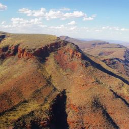
Multidisciplinary artist Shireen Taweel looks skyward, into the night and beyond, with her exhibition the trig point. Drawing on fieldwork in 2025 at the Siding...
It was back in 2011 that Pip Wallis, senior curator at the Monash University Museum of Art (MUMA), remembers first seeing the work of Balinese...
Senior Pitjantjatjara artist, Tuppy Ngintja Goodwin, was born in 1952 near Bumbali Creek in the Northern Territory, close to the border with South Australia; daughter...
For those of us who seek out unfamiliar voices and see the potential for diverse cultures to create new meanings and memories in a postcolonial...

Show me the beauty of a body contorted by thrall. Then, show me the thrall. Shame is a vast word....
Kon Gouriotis: How did you come to be working with the Yinhawangka community? Pedram Khosronejad: My journey to working with the Yinhawangka community has...
The Art Gallery of South Australia’s (AGSA) Adelaide Biennial of Australian Art has seen real competition over the past two decades, as other institutions have...