Tom Alberts
While preparing to open his show at Charles Nodrum Gallery, Ultramarine Blue, Tom Alberts spoke with Erin McFadyen about the experiments which have underpinned his new body of work.
Firstly, welcome back to Melbourne Tom! In early discussions about your work, Kate Nodrum told me that you’ve spent the past few years working in Paris, having moved there “short term” just before the pandemic. Did you find yourself making different kinds of work, or working differently, in a new setting?
Thanks Erin – it’s great to be back in Melbourne – a great city for artists. I found Paris to be a truly stimulating city, full of interesting people and some of the greatest collections of art in the world. It can’t help but influence how you see your own work, and encourages one to be the very best one can be. Even during the pandemic Paris had its charms, and the spooky, deserted boulevards and empty cafés had a poignant beauty.
I had the opportunity to work very hard and also experiment with my approach to painting – but I would say I was already on that path. When it was open, I worked a lot in the figure painting open studio at L’Académie de la Grande Chaumière. My beginner French meant I was basically mute, working flat out for three hours without uttering a word. I loved it!
My experiments were about trying to understand the origin of modernism and what it means in this moment. I wanted to reconsider how I choose colour, to allow myself to use line in painting, and to completely pull apart how I make form. All these ideas had begun before Paris, but they were amplified by the experience.
Your upcoming show at Charles Nodrum Gallery includes works across a whole array of genres. Let’s start with the portraiture – I notice that many of your nude subjects are named. Can you tell me a little about your working method with your models, and about this decision to name them in the paintings?
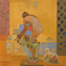
A lot of the paintings of nude subjects were made to a schedule and circumstances set by the Academie. It meant one had to work very hard and be very organised and (hopefully) be at peak receptivity for hours at a time. It was very concentrated and exhilarating.
My decision to use the model’s name came about because they really are portraits, and I work very hard to get the likeness. I wanted to counter this against the formal/experimental side of what I was trying to do. I’m making the point that they are not idealised or generic or interchangeable; each model makes a powerful and particular impression on me and I have to respond from the start to that particularity.
The largest nude subject was quite a lot of sittings but in better surroundings. Again, I was trying out ideas about paint, shape, line etc., but springing from my reactions to that marvellous vivid person. I’ll add that I don’t work from photos and don’t even like painting the background without the model there.
I’d like to talk about the pair of paintings Chairs Paris and La Chaise, both 2020. I can spot a few shared elements in these interior scenes, I think – the flooring, the chair – but La Chaise uses a really interesting multi-perspective device, as well as some framing of the scene within the canvas. How related are these paintings, and in what way? And, how and why did you develop the perspective device that you’ve used in La Chaise?
Both paintings were responding to the everyday things around me and were painted around the same time. La Chaise is an experiment in what I would call observational cubism.
Like most students, I was told a lot of rubbish about cubism being about looking at objects from many different angles. Well, I realised it’s not really very observational, much more abstract, much more about playing with representation and its limits. So La Chaise is an attempt to paint a cubist painting but really from observation – with multiple views and even a view out the window. The first layer looked rather like Chairs Paris, but I then overlayed another two differing views.
The oval border is a nod to the format of some of the high analytical cubist paintings by Braque and Picasso in the 1910s.
I notice striking blue lines around the forms in many of your paintings – from landscapes like Vue de Vieussan, 2020, to still life works like Apples on Table, 2020. Is this blue underpainted, or worked onto the pieces in some other manner? And, why are you interested in blue?
The blue lines do occur as under-drawing, then often as corrections, when searching for shape or edge during the painting process. Sometimes they “add atmosphere” or depth, and sometimes they may be a final summary. So, the blue lines function in many ways – although I should point out that I use other colours as well. I particularly like French Ultramarine Blue, and it seems it’s quite drawn to me as well.
Blue also interests me because of something Cézanne said: “We . . . experience nature more in terms of depth than surface, whence the need to introduce into our vibrations of light, represented by reds and yellows, a sufficient quantity of blue tones, to give a sense of atmosphere.” (Cézanne’s letter to Émile Bernard, 15 April 1904, in The Letters of Paul Cézanne, translated by Alex Danchev, Thames and Hudson, 2013).
So in summary, blue functions in many ways, and I continue to try things with it. I like the jump it gives!
You mention Cézanne in the title of one work, Still Life a la Cézanne, 2022 (and I can see why!). Which other artists inform your ways of working, interests, or ways of looking?
Well as a group I should mention a strand of British modernism including people like Coldstream, Uglow, and the Euston Road School, which I love – but it’s difficult to see because they’re not fashionable. I’m very interested in those reactions to Cézanne – so cubism, Giacometti, Matisse, etc. I saw a great show of Sickert at the Petit Palais. Alice Neel at the Pompidou was refreshing and brilliant, and a great show of Lucian Freud at the National Gallery in London. The Paris + par Art Basel showed how strong American–African new figuration is.
I go to lots of contemporary shows and most of all love to see the work of my peers. Overall, I look at lots of things, and really I think it’s about quality, the strength of following a path, and making something with resonance and depth. I ask myself: Is it highly “lookable-at”?


