
Pink Sensibility
Colour symbolism, cultural connotations, and gendered constructs uncurl and reshape relentlessly in Thinking Through Pink, asking: Can pink be uncoupled from the weight of Western ideology?


The outside walls of the Wollongong Art Gallery are clad in several panels of different shades of pink, from Pantone 7422C to Pantone 1767C, held up like a mother trying to decide what colour paint to choose for her child’s room. It signals the exhibition inside, Thinking Through Pink, by curator Dr. Sally Gray, which is expansive, multilayered, and without hierarchy. It spreads easily throughout the entire lower level of the building, taking over the four gallery spaces inside.
The exhibition draws from objects and artworks in the collections of Wollongong Art Gallery and the Powerhouse Museum, Sydney, as well as many invited contemporary artists. Dr. Gray had one single colour in mind: pink. That sounds like a simple enough premise, but as you walk through the exhibition it becomes apparent how large this process was – and how delightfully pink.
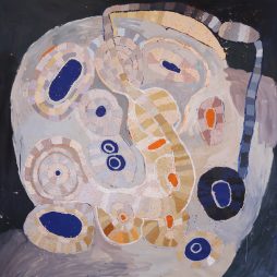
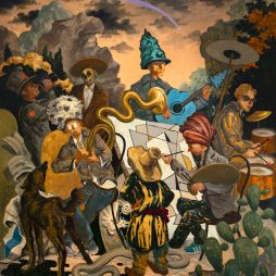
In Gallery 1, a soft humming emits from Worldweb Allthing, 2017, by artists Jess Johnson and Simon Ward, lending its strange meditative soundtrack to the room. This looped, mesmerising work spins in an eternal figure eight, an animalistic form made of human torsos, limbs, and toes, mouths open like clowns at a carnival. Alongside it sits a cabinet containing a few decorative objects, including a perfume bottle and stopper (c. 1845) with pink flowers. This – surreal digital imagery meets grandmother’s perfume bottle – is the first of many juxtapositions that Thinking Through Pink draws pleasure from.
Other works in this central gallery include two still life oil paintings of flowers by Albert Sherman, and one by Frederick McCubbin, Dreaming is Free, 2016, by Paul Yore, and the delicately contrasted Parachute, 2005, by Pat Brassington. New parallels are drawn in this space between the contemporary surrealism of Brassington’s ominous fantasies and paintings by little-known surrealist Joan Meats – and others, like the incredibly detailed Goodness Knows Where, 2001–14, by surrealist painter Iain Whittaker, which depicts a goddess stifling a yawn as her throne flies above bucolic countryside and a small town. You begin to get the sense that this part of the exhibition is like a dream in pink. Above the room, some text reads: “A sensibility… is one of the hardest things to talk about – Susan Sontag, writer and critic.”
You couldn’t stage an exhibition like this with another colour. It had to be pink.
Pink for its cultural, gendered, and social resonances; pink for what it does and doesn’t represent. Pink for nature, for fashion, for politics, and for identity. Pink for (oh, please no) yet another gender reveal party. Better yet, pink as a window through which to view history; pink for feminist marches and for representing queer rights.
For all these reasons, like I said, it had to be pink.
You could look past the cultural evolutions and associations of this colour and just enjoy the pretty colours, which the exhibition notes invite you to experience as “pure visual pleasure.” But even if you were inclined to take up this invitation, the art would inevitably remind you why the frivolous, revolutionary pink has left its indelible pigment on all of us.
Gallery 2 hammers this home in a more political tone. A large pink banner reads: “Sydney Anarcho Feminists,” alongside second-wave feminist posters by Jan Fieldsend and Marie McMahon. These show how pink is used for more than decoration, with the colour co-opted by movements to deconstruct notions of femininity. Gallery 2 is also where you’ll find Daniel Mudie Cunningham’s reimagined True Colours, 2016, that queers Australian nationalism in the wake of the Cronulla riots to the tune of Cyndi Lauper’s anthem. This thread of political queer art continues in David McDiarmid’s Rainbow Aphorisms series, 1993–95, which Dr. Gray says in her catalogue essay greatly influenced her interest in researching chromophobia: “Exploring chromophobia’s links to sexism and homophobia, and the emotional limitations it may reflect and reinforce became something of an obsession,” she writes.
Whether we can enjoy pink without the cultural weight that the colour carries is another question raised by the exhibition. It’s there in aforementioned collisions between decoration and contemporary art, particularly in the playful interruptions of nineteenth- and twentieth-century decorative objects, such as a collection of Bunnykins figures by Royal Doulton and a pair of elaborate rococo porcelain figures (Germany, c. 1880s). What do Flopsy, Mopsy, and Cottontail have in common with Stink Eye, 2021, by Deborah Kelly? These juxtapositions inject the exhibition with a non-hierarchical experience of colour, intentionally loosening the ties of curation to allow for surprise.
Personally, I had a pink-washed girlhood clad almost entirely in pink lace and ribbons that were never allowed to get dirty. This early experience left me with little pleasure for the colour pink. Unexpectedly, Thinking Through Pink has restored my pleasure in it, and more importantly made me question my previous dislike. Now when I think of pink, I’ll remember Emma Goldman’s sentiment that inspired the feminist posters of Jan Fieldsend, which still holds true even if Goldman didn’t coin the misattributed quote. I’ll think of pink as dancing at the revolution.
Dr. Brooke Boland is a freelance arts writer on Wodi Wodi, Jerrinja, and Yuin Country of the NSW South Coast.
EXHIBITION
Thinking Through Pink
3 December 2022 – 5 March 2032
Wollongong Art Gallery, New South Wales
Senior Pitjantjatjara artist, Tuppy Ngintja Goodwin, was born in 1952 near Bumbali Creek in the Northern Territory, close to the border with South Australia; daughter...
For those of us who seek out unfamiliar voices and see the potential for diverse cultures to create new meanings and memories in a postcolonial...

Show me the beauty of a body contorted by thrall. Then, show me the thrall. Shame is a vast word. The...
Kon Gouriotis: How did you come to be working with the Yinhawangka community? Pedram Khosronejad: My journey to working with the Yinhawangka community has...
The Art Gallery of South Australia’s (AGSA) Adelaide Biennial of Australian Art has seen real competition over the past two decades, as other institutions have...
Michael Vale views colonialism as the elephant in the room when it comes to Australian history and Australian art. He observes that through a strange...
(for Michael Petchkovsky) You passed so quickly, it pulled the oxygen out of the air Drawing sorrow in behind you, like a myst Burning...
While most of Hobart is asleep, Maggie May Jeffries is crawling around in her backyard nasturtiums with a torch, finding inspiration in the intricate details...
i make it so that that every place i live is my home so i put my bed on the wall closest...