
Katherine Hattam
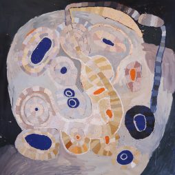
Katherine Hattam’s Melbourne house and studio sing with her paintings, in clear, bright, sharply defined colours. Each of her prints, and their plywood blocks, has only one colour, but these have a tonal quality she doesn’t seek in her painting. Thus the prints and blocks form a sort of baseline, a depth, to the visual song.
Hattam spoke to Judith Pugh in Issue 39 of Artist Profile.


You exhibited before you trained formally?
For a long time, from about sixteen to thirty-eight, I just drew unconsciously, from what was around me, immediately. I’d been to university majoring in literature and political science. I liked that whole academic thing, but I kept drawing, and had my first exhibition at the George Paton Gallery at Melbourne University. It’s been a very long process, getting into painting. I didn’t go to art school until I was thirty-eight. Artists used to say to me, “This is black and white; it could be colour” and I’d say “uh-uh …” but it wasn’t as simple as that for me. There’s a directness with drawing, there’s the stuff of paper, there’s really lovely stuff …
Then because the work got into a bit of a hole, and because people kept telling me, I went to the Victorian College of the Arts and did a Masters in Painting. The masters made me think rather than do. When I went to university it was about modernism: you read to find what’s in the text. At the VCA we were taught post-modernism. “No, it’s what’s between the reader, the viewer and the work.” I fought that for two years, then it sank in . . . but I’m still a modernist really. The Masters was fantastic, it made me rethink everything. I came back to the same position, but consciously, rather than unconsciously.
You’d shown big black and white drawings?
Yes. The prints relate to the drawings, and definitely influence the paintings. It’s not just the subject matter, a print might come first and lead to a painting. You have to choose the colour very carefully for the print, as opposed to painting where you can put it on, rub it off, a process of experimenting. Even though you can roll it up again in another colour, it’s a big decision. I plan.
I’m not a technical printer, I work with a master printer. Before I work with someone, I plan. OK, I’m going to use this orange . . . in painting I’m not working with someone else, I don’t have to make that decision. My drawings, though black and white, also have this positive and negative space, which is what comes out in the prints. Also I’ve always taken photographs, I love with the printmaking to be able to use those, which unlike my drawings are tonal. Cathy Leahy, the Senior Curator of Works on Paper at the National Gallery of Victoria (NGV) opened a show of mine of these relief prints and blocks, and described the process as pioneering. She pointed out the unusual combination of the old technology of wood block printing with that of the new digital and laser printing. She also commented on the originality of exhibiting the blocks.
How are these prints made?
They are inscribed onto plywood. I get a high-resolution scan, I work on the file, I take that to a place that works with industry, I’m probably the only artist they deal with, they’re kind of curious. I work with them and they inscribe the plywood. It takes about a day to inscribe a block.
It’s either a documentary process, such as this print about Julia Gillard leaving the Lodge in Canberra. She’s not there, it’s the removalist, the picture was very small, taken with a telephoto lens, spying on her. The trees are very important. There’s an element of surprise in these pictures which I then get to work with, not to plan for. It’s the same kind of thing in painting, you work it out by doing it.
Or it’s a collage, like The Platypus and the Shopping Trolley. The Merri Creek is full of those things, the rubbish and the platypus; three platypus have been found right near here . . . those two strands.
You do work on the digital file?
I do and I don’t. If it’s documentary, I don’t. The collages are not digital collages, they’re old style handmade collages, it’s me putting the images together, and then photographing them, and these images are digitally inscribed into the plywood. It’s a mechanical process. I then work with a printmaker to roll them up, and you have to roll them up a lot of times, to force the ink into the plywood, we put it through the press probably nine times, sometimes, to get . . . not just the print, but to force the ink into the block. As it’s happening, I decide what is working, the print or the block or both.
And sometimes you just end up showing the block?
Yes. My initial focus was to get the prints, then I said to my son [artist William Mackinnon], “This is really not working,” and he said, “But have a look at the blocks.”
Sometimes the print works better. This one, for example, Suburban Church: here the block for that was pretty boring, but the print was stunning. I love this trial and error, where what happens just comes out of the wood. Some of that is chance, but it’s also which timber you choose. What I want in that is the black of the inscribing process, and I have to battle with the technician who wants no black.
What is the edition when you make a print?
Not a lot, about seven.
I think of those Japanese prints that were so influential in early modernism.
I’ve always loved them, I’m always looking back at them. At the NGV you can see the whole process, and they are a continuing influence. This relief print, The Pines, is a four-panelled image from a digital collage. It represents (through clocks, analogue and digital) different experiences of time; real and psychoanalytic timeless time. Similarly, the chair is a recurring motif. There is the internal stuff, things in your head, and then the outside world, the external, that’s kind of continuing, what interests me is how they affect each other.
In the painting White Merri Creek the images down the side: Nolan, Ellsworth Kelly, etc . . . figuration, abstraction . . . come out of my response to a wonderful little painting at the NGV, The Man of Sorrows in the Arms of the Virgin [Hans Memling, 1475 or 1479] – the things that matter are down the sides. And there’s a bit of a feminist text, the graphic is still important, the negative space is important. I’ve simply used white gouache, pencil, and plywood. It’s about country/city, the bastardised rural thing. The Merri Creek, it’s my bit of nature nearby.
I think the paintings on plywood and those on the book pages are heavily influenced by the prints. In all of these the negative spaces are very important. In paintings like Women the Longest Revolution the book pages are collaged onto the canvas like a grid, with drawing overlaid. Sometimes the paintings come before the prints, and vice versa. Using plywood with the prints, I decided that that tone and the colour were very like the book pages. When Mum died, that was about 2004, we inherited lots of books and I decided to recycle them.
Plywood for the prints, then you painted on plywood?
Yes, in the large vertical painting Sometime, which is gouache on plywood, I was actively looking for something abstract in the outside world, hence Federation Square. Alongside is Shoreham where I holidayed as a child, somewhere rural. What I wanted to have was this sense of the inside and the outside world, the table, the landscape also public and private, the house and the studio, the public space. Sometimes it’s from the Leadbelly song, Goodnight Irene: “Sometimes I live in the country, Sometimes I live in town.”
The print Suburban Church, this exotic thing in East Brunswick, emerged from a really cheap bit of plywood: it just worked. The plywoods really vary, I choose that and accept change. I’m chasing the accident. I can edition the prints but not the blocks, I also exhibit the blocks, sometimes without the print. The blocks can’t be editioned, they are unique.
This interview was originally published in Artist Profile, Issue 39, 2017
EXHIBITION
Our Swans Are Black
18 January – 13 February 2023
Queenscliff Gallery, Victoria
The first work you encounter in Edge City is a gate, Settlement #8, 2025. Not one to pass through (not anymore), but a threshold nonetheless....
Designed to impress, the number and size of paintings—twenty-nine at nine square metres each and one even bigger—are a spectacle, lifting the exhibition from an...
Skilfully assimilating secondary sources throughout Paris in Ruins, Smee at the conclusion of Part One, “Salon of 1869,” writes that Auguste Renoir’s and Claude Monet’s...
Multidisciplinary artist Shireen Taweel looks skyward, into the night and beyond, with her exhibition the trig point. Drawing on fieldwork in 2025 at the Siding...
It was back in 2011 that Pip Wallis, senior curator at the Monash University Museum of Art (MUMA), remembers first seeing the work of Balinese...
Senior Pitjantjatjara artist, Tuppy Ngintja Goodwin, was born in 1952 near Bumbali Creek in the Northern Territory, close to the border with South Australia; daughter...
For those of us who seek out unfamiliar voices and see the potential for diverse cultures to create new meanings and memories in a postcolonial...

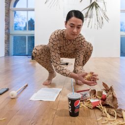
Show me the beauty of a body contorted by thrall. Then, show me the thrall. Shame is a vast word....
Kon Gouriotis: How did you come to be working with the Yinhawangka community? Pedram Khosronejad: My journey to working with the Yinhawangka community has...